
The Brain-Color Connection: The Cognitive Power of Color in Business and Leadership
Color is more than a visual experience it’s a form of communication. Every hue sends a signal to the brain, influencing perception, emotion, and behavior. From your brand palette to the walls of your workspace, color affects how people think, feel, and respond. For leaders, entrepreneurs, and professionals, understanding the psychology of color is not about aesthetics, it’s about strategy.
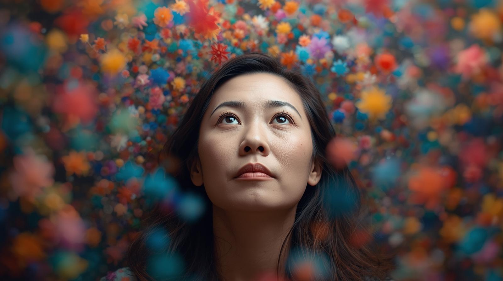
The
Neuroscience
of
Color.png)
Research consistently shows that color impacts both the brain and body. Red tones elevate heart rate and stimulate appetite, while blues tend to lower blood pressure and promote calm. In one striking example, train platforms in Tokyo introduced blue lighting to reduce suicide attempts and saw a 74% decrease. In correctional facilities, painting walls blue or pink has been shown to lower aggression levels. These aren’t coincidences; they’re neurological responses. The brain processes color through the visual cortex, sending immediate signals to the limbic system, which governs emotion and motivation. The result is often an unconscious shift in behavior. Color also influences memory. Studies show it’s one of the strongest cues for recall, second only to smell. That’s why a brand’s color scheme, once internalized, becomes so powerfully linked to its identity.
Color and Personal Perception
While certain responses to color are universal, others are shaped by personal experience, culture, and association. A person who grew up in a bright green kitchen may find that color energizing or, conversely, overwhelming. Another might feel uneasy around a particular color simply because it’s tied to a difficult memory. Our individual experiences create emotional filters, making color an intensely personal yet scientifically grounded medium of influence.
The Strategic Use of Color in Branding
In business, color is one of the most overlooked drivers of trust and engagement. It shapes first impressions before a single word is read. When a brand’s colors align with its values and message, the result feels authentic. When they don’t, the disconnect is immediately felt even if the viewer can’t articulate why.
 Consider
how
each
color
communicates
distinct
psychological
cues:
Consider
how
each
color
communicates
distinct
psychological
cues:
🔴 Red – Action and Energy Red evokes movement, power, and urgency. It draws attention, stimulates appetite, and inspires action, making it effective for calls to action or limited time offers. However, too much red can trigger tension or anxiety. Use it sparingly for impact.
🔵 Blue – Trust and Stability Blue is the color of reliability. It communicates professionalism, security, and calm qualities ideal for finance, healthcare, and corporate branding. Blue is also known to lower heart rate and reduce stress, making it equally effective in-home offices or meeting spaces.
🟢 Green – Growth and Balance Green represents prosperity, renewal, and balance. It’s a natural choice for brands tied to wellness, sustainability, or finance. In interiors, green fosters relaxation and helps maintain focus, particularly in high-stress environments.
🟡 Yellow – Optimism and Creativity Yellow radiates warmth, joy, and energy. It captures attention and sparks innovation, making it effective for creative industries or personal branding. In excess, though, it can feel overstimulating. Yellow is best used as a bright accent rather than a dominant tone.
🟠 Orange – Confidence and Connection Orange blends the vitality of red with the cheer of yellow. It conveys enthusiasm, friendliness, and approachability. For brands focused on motivation or collaboration, it creates an atmosphere of engagement and momentum.
🟣 Purple – Insight and Imagination Purple signifies creativity, wisdom, and luxury. It has long been associated with royalty and depth of thought. In modern branding, it represents innovation and emotional intelligence. Purple is an ideal choice for visionary leaders or brands built on expertise and originality.
⚫ Black and ⚪ White – Authority and Clarity Black communicates sophistication, power, and exclusivity, while white suggests simplicity, clarity, and transparency. Together, they create balance and visual hierarchy. The contrast between the two directs attention and reinforces professionalism.
🟤 Brown – Stability and Warmth Brown conveys dependability and balance. It works particularly well for brands and environments connected to nature, comfort, or tradition.
.jpg)
Applying Color Psychology in Everyday Environments
The influence of color extends far beyond branding. It shapes mood, focus, and emotional well-being in the spaces we occupy every day.
- For calm and focus: Incorporate soft blues and greens in offices, bedrooms, or meeting areas.
- For creativity: Add yellow or orange accents in workspaces or brainstorming zones.
- For harmony at home: Use earth tones and balanced neutrals to foster connection and reduce stress.
- For rest and reflection: Choose muted or pastel shades that encourage peace and presence.
Even small shifts in colors such as changing the tone of a wall, your desktop background, or your presentation slides can subtly change how people feel and respond.
The Cognitive Power of Color
Color enhances learning and recall. Associating information with specific hues can improve memory retention and retrieval. This is why many effective presenters and educators use color strategically, to emphasize key points and improve engagement. For leaders, it’s a reminder that color isn’t just design; it’s a tool for influence and communication.
 Final
Thought
Final
Thought
Color is more than an aesthetic choice; it’s a language of the brain. It affects trust, focus, emotion, and behavior, shaping how others perceive you, your brand, and your environment. So, take a look around your workspace, your website, or even your wardrobe. What messages are your colors sending?
With a deeper understanding of color psychology, you can design spaces, brands, and experiences that don’t just look good, they work on a cognitive level. Because when color is used intentionally, it becomes one of the most powerful and understated tools of leadership and design.
-Julie "Brain Lady" Anderson